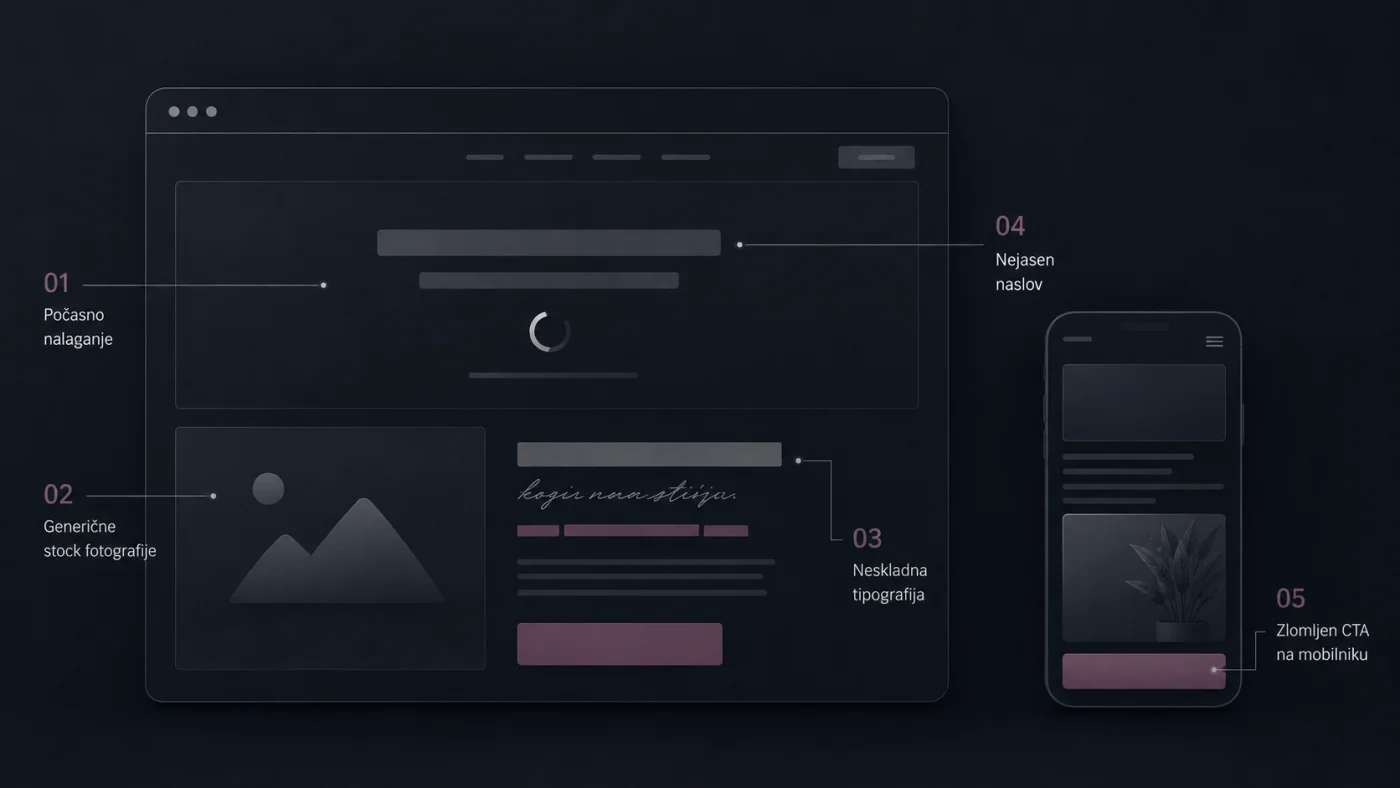
A visitor decides whether to keep reading or close the tab in roughly five seconds. That decision happens before any value proposition, any feature list, any pricing page. It happens on vibes — the sub-conscious read of whether a site feels credible enough to invest more attention in.
Most websites fail the test for boring reasons. Not because the brand story is weak or the copy is unclear, but because of five small decisions that quietly leak trust before the visitor even gets to the point. Here's the short list.
1. Load times above three seconds
Largest Contentful Paint above 3 seconds correlates directly with higher bounce rates. The mechanism is brutal: while the hero image loads, the visitor is reading your decisions. A slow site signals that someone shipped this and stopped paying attention. A fast site signals the opposite — care, recency, presence. The fix isn't a CDN. It's designing for the budget you actually have: compress media before upload, lazy-load below-the-fold images, ship the hero as a static asset, not a CMS-rendered template.
2. Stock-photo people who don't exist
The smiling-team-around-a-laptop photo costs you more credibility than any single design decision. Visitors have seen the same hands holding the same MacBook on a thousand websites. A real photograph — even a bad one — outperforms the slick stock alternative every time, because it signals that there's an actual human on the other side of the screen. If you don't have real photos yet, an abstract visual, a product detail shot, or a typographic hero beats stock people 10/10.
3. Three different typefaces fighting for attention
Inconsistent typography is the most common — and most invisible — trust leak. Heading in one font, body in another, button text in a third, navigation in a fourth. Each one chosen because it looked good in isolation; together they read as a Frankenstein. A single well-paired display + body combination almost always outperforms three "tasteful" ones. Strong sites limit type to two families and commit hard.
4. Headlines that explain nothing
"Empowering tomorrow's future, today". "Solutions that scale". "Where innovation meets opportunity". These don't describe what you do; they describe a vibe. Visitors scan headlines first, and a headline that doesn't answer what is this and who is it forwithin two seconds is wasted space. Specific beats inspirational every time. "Custom websites for AI startups across the EU" lands. "Solutions that move you forward" doesn't.
5. Mobile layouts that quietly break
Sixty-plus percent of first visits happen on a phone, and the layouts that quietly break aren't the obvious cases. They're the edge ones: a CTA button cut off at the screen edge, a nav menu that requires scrolling to the top to reach, a hero video stretched portrait on a 9:19.5 screen, hover states that have no equivalent on touch. Every one of these works fine in DevTools mobile mode and breaks on a real phone in landscape. Premium sites test on real devices, not just emulators.
The pattern underneath
Every item on this list shares a root cause: the team shipped what was workable instead of what was considered. None of these failures are about budget or talent; they're about which decisions earned scrutiny and which got defaulted-through. The brands that earn the first five seconds are the ones where every layer of the site — performance, imagery, type, copy, mobile — was treated as a real decision, not a carryover from the template.
If your site is slipping any of the five, the fix is rarely a redesign. It's a clear-eyed audit of which decisions never got made, and then making them.